Fonts can quietly slow down your Webflow site. You might not notice it at first, but bloated font files hurt your site's performance and ultimately lower conversions.
A custom font that loads in 800ms might seem perfectly fine to you, but to a visitor, it can needlessly delay the page and push them away. While designers understandably focus on optimizing images, fonts can easily consume 20–30% of a page's total weight. Worse still, they often block your text from displaying until they are fully loaded.
The good news? You can fix this relatively easily without sacrificing your design.
Here is a straightforward guide to making your fonts noticeably faster in Webflow.
1. Use variable fonts
Variable fonts are a massive upgrade, replacing multiple traditional font files with a single, highly efficient file.
Instead of loading separate files for Regular, Medium, and Bold weights, you load one unified file that handles all font variations.
This drastically reduces space and significantly improves performance. Instead of requesting 4–6 separate files for various weights, the browser only needs to make a single HTTP request.
Example:
- Traditional way: 6 font files = ~219KB
- Variable font: 1 file = ~95KB
That is an instant 50% reduction in size.
Additionally, you gain smooth, granular control over font weights instead of being limited to predefined steps.
How to implement them:
- Download a variable font (typically labeled "Variable" in the file name).
- Upload it into your Webflow fonts settings.
- Adjust the weights directly in the designer just as you would with a static font.
Popular choices include Inter, Manrope, and Work Sans.
2. Always use WOFF2
When uploading fonts, WOFF2 is the modern standard—use it exclusively.
WOFF2 files are approximately 30% smaller than older formats like WOFF, and they are fully supported across all modern web browsers.
If you purchase or download a font in TTF or OTF format, be sure to convert it before uploading it to Webflow.
Tools you can use:
3. Remove what you don't need
Commercial fonts often arrive packed with thousands of characters and symbols, most of which a typical website will never display.
You can remove these unnecessary glyphs through a process called "subsetting."
Subsetting drastically reduces your overall font file size.
Example:
- Full font package: 168KB
- Latin-only characters: 42KB
- Basic set: 28KB
This is a massive optimization.
What to keep:
- English sites: Basic Latin + Latin Extended.
- Multilingual sites: Add the specific language sets you need.
Tools for Subsetting:
Be careful, though: if you remove too many characters, any missing glyphs on your site will render as empty placeholder boxes.
4. Pick a good fallback font
A fallback font is displayed temporarily while your main custom font is downloading.
If your fallback font doesn't match the proportions of your final font, your layout will aggressively shift once the custom font arrives. Text will jump, buttons will resize, and the overall experience will feel broken.
Always choose a fallback font that closely matches the scale and geometry of your custom font.
Good default options:
- Sans-serif:
system-ui, Arial - Serif: Georgia
- Monospace:
ui-monospace
You can also fine-tune your CSS to match the exact size and spacing of your custom font using font matching tools.
In Webflow, ensure you set your font stack to gracefully degrade:
"Your Custom Font", system-ui, sans-serif
Never rely entirely on the browser's generic default.
5. Preload key fonts
You can instruct the browser to prioritize loading your key typography immediately before it even begins parsing the rest of the page.
This ensures text is rendered as quickly as possible.
Add this snippet in your site's custom <head> code:
<link rel="preload" href="https://cdn.prod.website-files.com/.../your-font.woff2" as="font" type="font/woff2" crossorigin>You can find the direct URL to your Webflow font files within your published site's CSS source code.
However, be cautious: only preload your most crucial fonts (typically your main body text and hero headings). Preloading too many assets at once can negatively impact overall load times.
Why this matters
While each optimization helps individually, their combined impact is enormous.
- Variable fonts condense multiple files into one.
- WOFF2 compression heavily cuts file size.
- Subsetting strips away useless data.
- Proper fallbacks prevent layout jarring.
- Preloading guarantees your content is readable sooner.
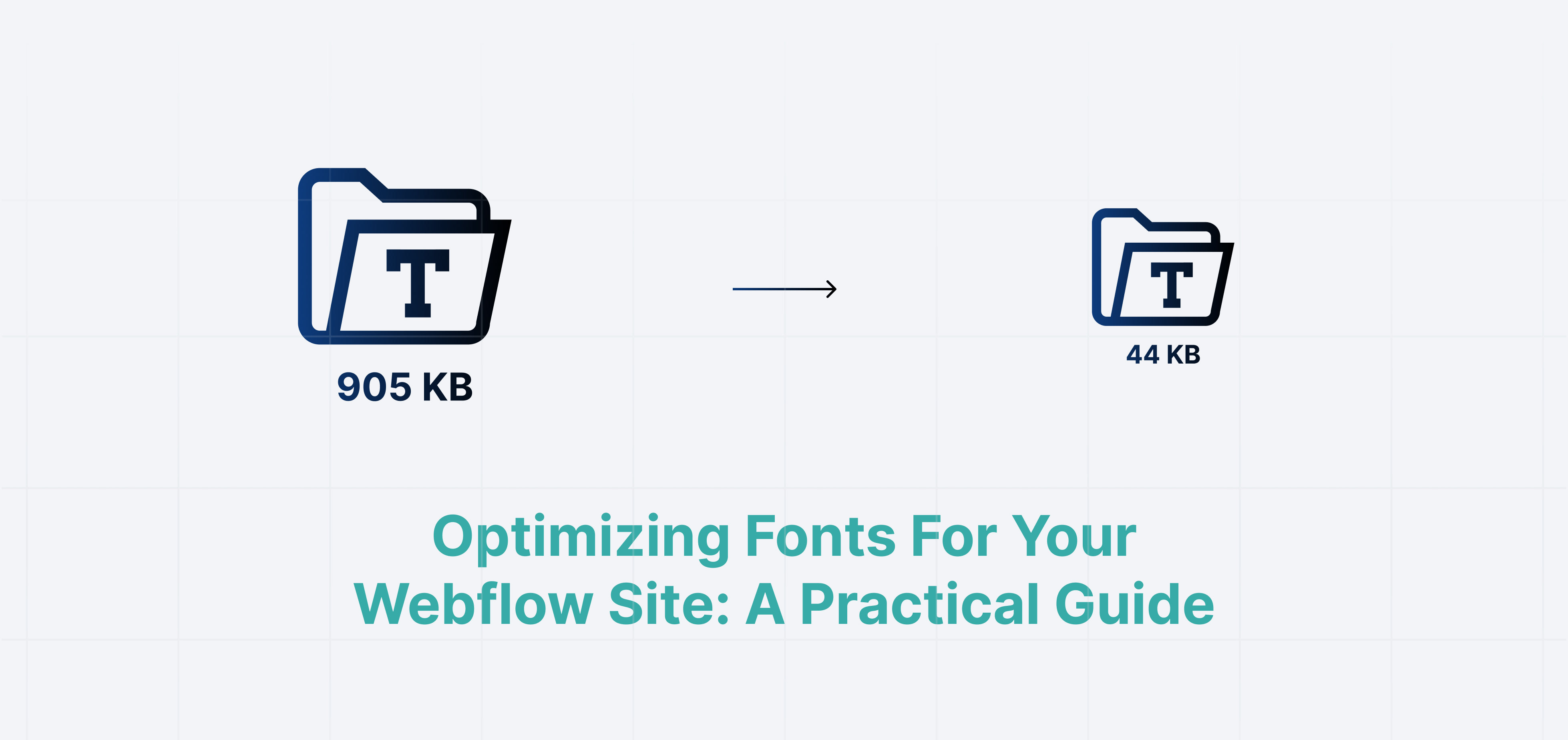
With these steps, a standard webpage might drop its font payload from a whopping 300KB down to a sleek 40–60KB.
That represents an incredible 80% reduction in size.
As a result, your site loads faster, feels smoother, and allows users to immediately interact with your content.
Quick checklist
Keep this checklist handy for your next Webflow build:
- Use variable fonts wherever possible.
- Convert all font files to WOFF2 format.
- Subset fonts to remove unused languages and glyphs.
- Define appropriate fallback fonts to stop layout shifts.
- Preload your most important fonts in the head.
- Run a performance test to verify text load speeds.
- Check your site on a throttled 3G/4G connection to experience your font loading first-hand.
Final note
Typography optimization isn't always the most glamorous part of web design, and visitors may not consciously notice the difference.
But they will undoubtedly feel the improved speed.
Your pages will snap into place, layout shifts will vanish, and your site will feel undeniably professional.
Start simply by using variable fonts and WOFF2, and then gradually weave the more advanced steps into your regular workflow.