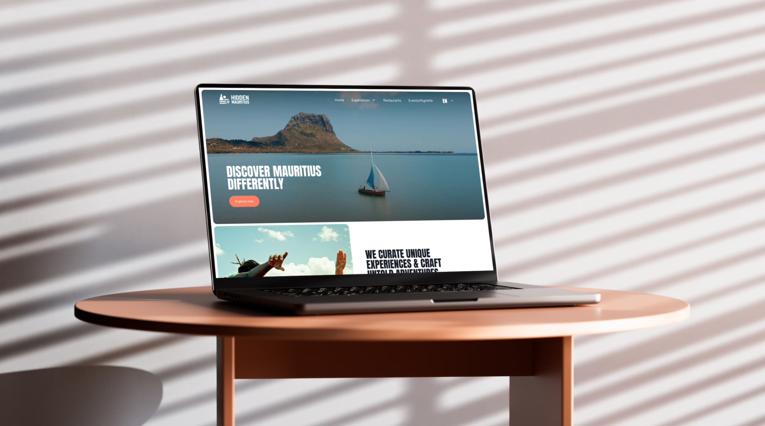
Hidden Mauritius
A community-powered platform to find and recommend trusted local businesses in Mauritius.
Tools used

Figma

Photoshop

Laravel PHP
Services
- UI/UX Design
- Front/back end development
- Project Management
Client
Hidden Mauritius
Year
2026
Project background
This client came to us with an existing design, but there were several aspects of the UI/UX that they were not convinced or satisfied with, mainly regarding the user journey and how users would interact with the website. During the analysis of the user journey, our team identified different elements that could make it difficult for users to convert on the main experience page. After careful consideration, the client decided to rework the UI/UX design from scratch. We conducted multiple user interviews and collected feedback to better understand the goals and mission of Hidden Mauritius. Based on these insights, we began redesigning the project, which was later developed by our team with full integration of a custom CMS.
Client’s feedback
Our platform was created with the support of the Vertex visionary team who helped shape the idea from concept to reality. Responsive, proactive, and deeply invested...
Ashley
Founder @ Hidden Mauritius
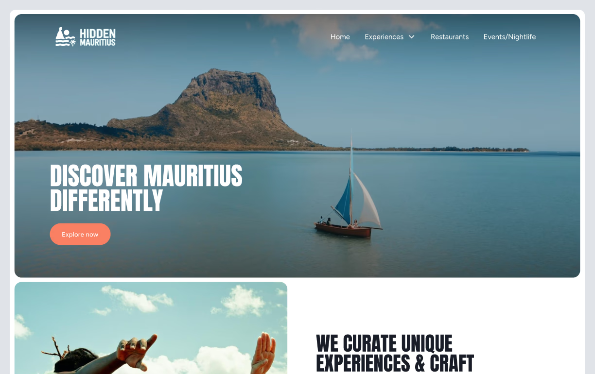
User Experience Journey
On a positive note, the client had a clear vision of the conversion goals they wanted to achieve. We began by defining the user journey and creating detailed personas to ensure the design would align with real user needs. Each step of the process was designed and presented to the client for feedback and validation, allowing us to refine the direction collaboratively.
Once we identified the required pages for the project, we developed a site map to structure discussions around the sections and content that should appear on each page. This approach laid the foundation for the first phase of wireframing and ensured that both teams shared a common understanding of the website architecture.
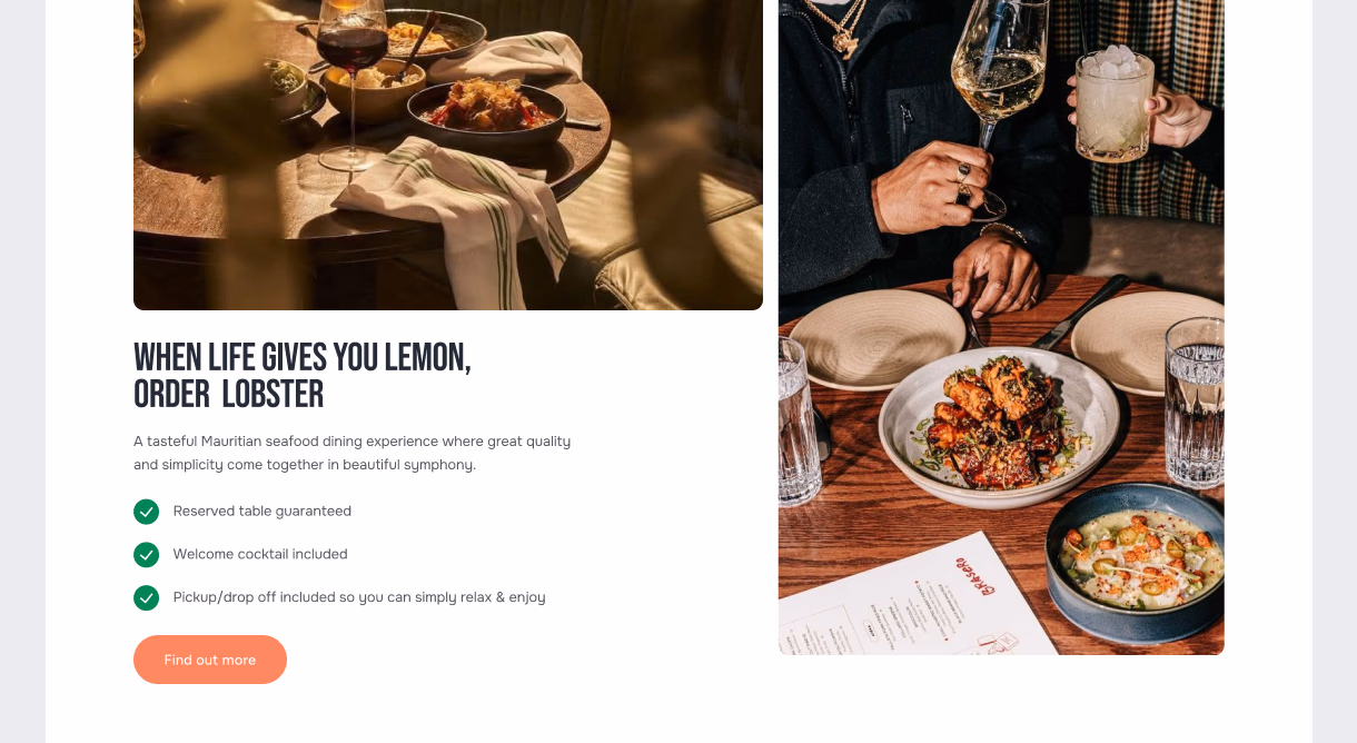
We then focused on building low-fidelity wireframes for each page, carefully defining the layout and structure to establish a solid UX framework. After validating the low-fidelity version, we moved on to the high-fidelity design, integrating key UX elements such as CTA placement, visual hierarchy, and navigation structure. Particular attention was given to designing an intuitive navigation bar to ensure a smooth and consistent user experience across all pages of the website.
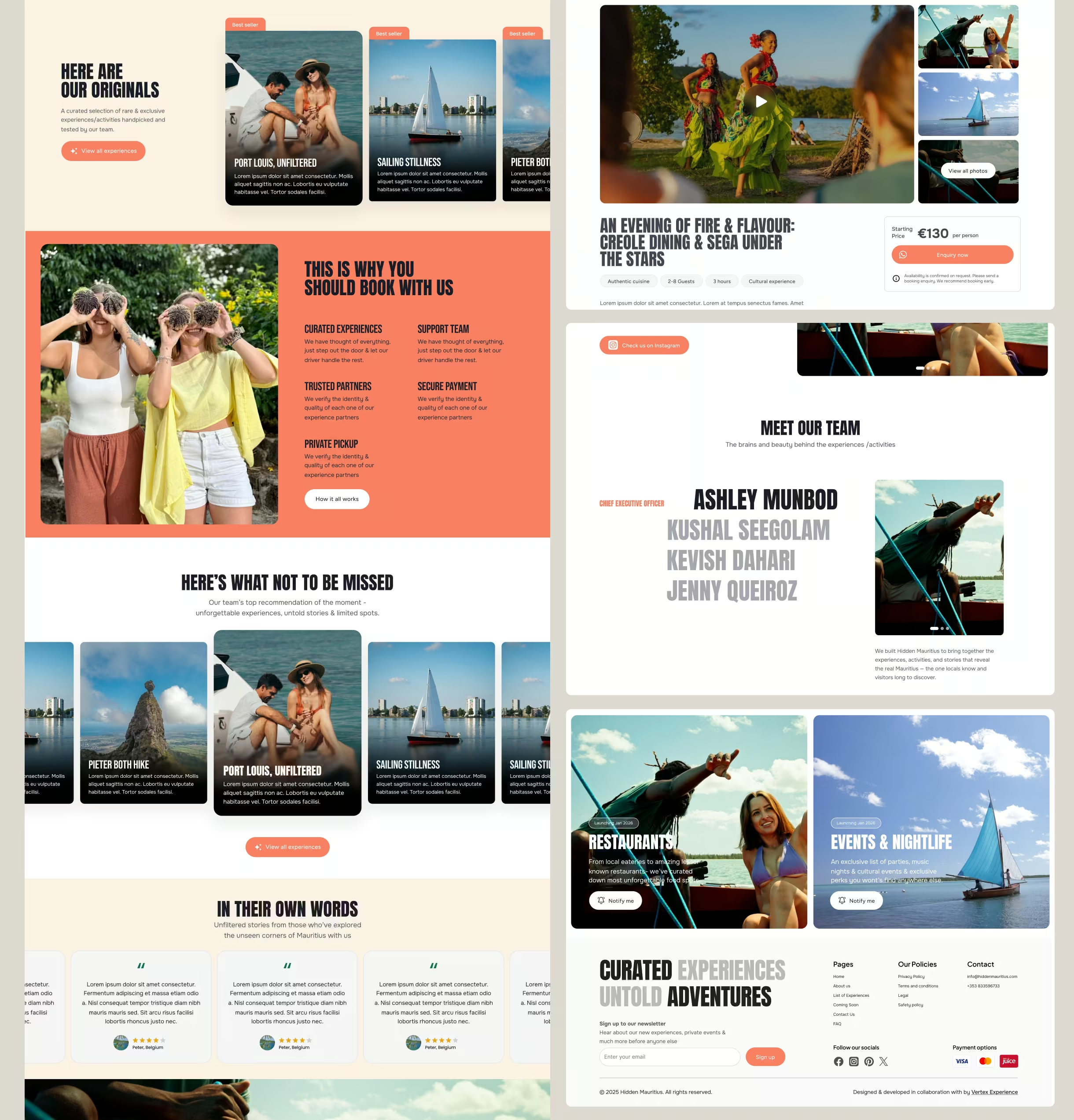
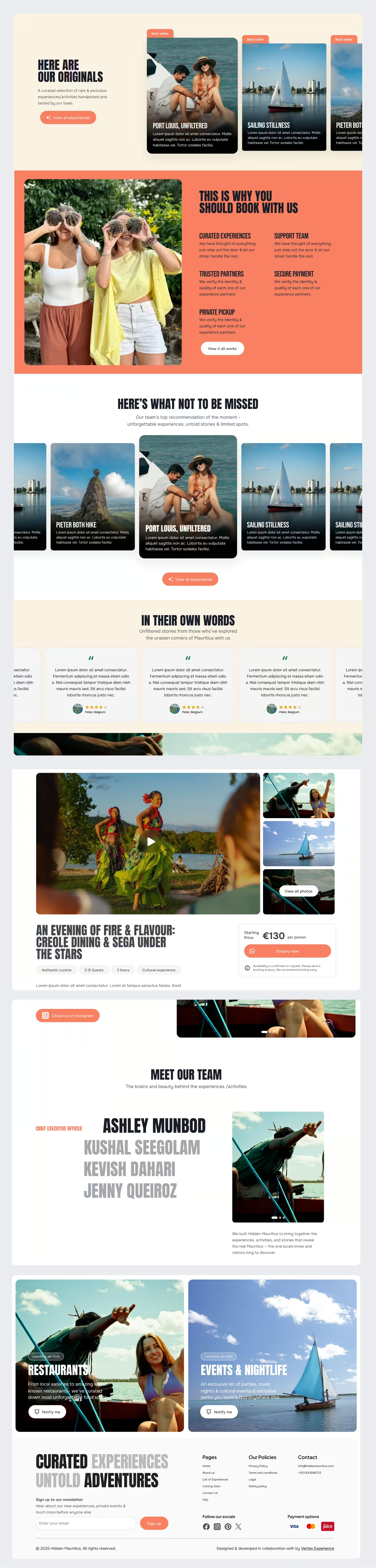
Solution
Instead of jumping straight into visual design, we began with user research to gather meaningful insights. For us, research is not just a checkbox, it is the foundation of every design decision. What truly matters is how those findings are translated and applied during the wireframing phase.
Based on the data collected, we created low-fidelity wireframes and tested them internally with our team. This lean and iterative approach allowed us to quickly identify potential usability issues and explore alternative solutions before committing to high-fidelity design. By validating structure and user flows early, we ensured that the final design would be both user-centered and conversion-driven.
Development
For this project, we used Laravel with Filament as the backend solution. We enjoy working with Filament because it provides clients with a simple and intuitive interface that is far easier to navigate than traditional CMS platforms such as WordPress. This ensures that non-technical users can manage content with confidence and independence.
We began the development process with the front end, carefully implementing the design from Figma. Each breakpoint was meticulously crafted to ensure the website delivered a consistent and engaging experience across all screen sizes. The well-structured Figma file played a key role in accelerating front-end development and maintaining design accuracy throughout the build.
On the backend, we configured essential elements and functionalities to allow the Hidden Mauritius team to manage the website autonomously, without relying on a developer. This approach helped the client remain within budget while enabling them to test their MVP with real users and iterate quickly based on feedback.
🛠️ Kickoff & Audit
Week 1
- Onboarding and project handover from previous designer
- Comprehensive audit of existing Figma design files
- Discovery of usability gaps and inconsistencies in UX logic
🧠 Research & Strategy
Week 2 - 3
- Persona development
- Structuring of end-to-end user flows
- Defined goals for each user type
🧱 Wireframing & Testing
Week 4 - 5
- Created low-fidelity wireframes based on research
- Collaborative reviews and iterative refinements
- A/B testing to validate design decisions
🎨 Design Refinement
Week 6 - 7
- Applied updated branding across all screens
- Worked on the responsiveness of screens
- Finalized user flows and states
🚀 Client Reviews
Week 8 - 9
- Weekly calls for review & feedback
- Knowledge sharing with the client team
- Final delivery of redesigned files
💻 Development Starts
Week 10 - 15
- Developing and testing components
- Responsive design implementation
- Weekly check-ins between design & dev teams for alignment
Process
We used Figma for all design work and FigJam for brainstorming sessions and ideation. Weekly calls were scheduled to align on objectives, share progress, and address any challenges or open questions throughout the project.
Communication between the client and our team was seamless and collaborative. Every idea and question raised during the process was carefully considered, ensuring that no detail was overlooked and that all perspectives were taken into account. This open dialogue played a key role in shaping a solution that truly reflected the client’s vision and user needs.
Summary
Our team’s goal was to address and resolve all the pain points the client was experiencing while delivering a solution that aligned with their vision and business objectives. We successfully designed, developed, and launched the project within just three months.
The Hidden Mauritius team played an essential role throughout the process, providing timely feedback and ensuring we had all the information needed to move forward efficiently. Their collaboration and transparency helped us maintain momentum and deliver a final product that truly met their expectations.
Featured work
Some projects cannot be showcased due to agreement so if you want to see more, please get in touch with the team.
Click Here