


Studio Des Iles
“Dreams of elevated experiences and creating new stories that inspire, innovate, and transform.”
Project background
We partnered with Kanimata, led by Franck Dacosta, for this project. The architect, Jean-Marc, wanted to create a website that reflected his own vision. He founded STUDIO DES ILES, a space where he could blend his personal heritage with professional expertise.
Although Jean-Marc already had a website, it felt too plain and didn’t really showcase his work or skills effectively. He wanted something more meaningful, not necessarily to attract new clients, but to use as a portfolio to quickly present his work. This insight helped guide our design decisions.
Client’s feedback
Dhiren was a key part of the project’s success. His UX thinking is solid, and his attention to typography gives the designs a polished, high quality feel.
Franck
Agency Owner @ Kanimata
Problem Statement
After speaking with the client, we found out the existing website was built from a basic template. While templates are fast and easy to use, they rarely reflect a brand’s personality or business goals.
At Vertex Experience, we believe in designing from the ground up. We worked closely with the client to understand the weaknesses of the old site and the goals of the new one. These conversations helped us uncover key pain points and allowed us to address them during the UX design phase.
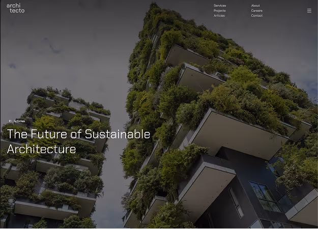
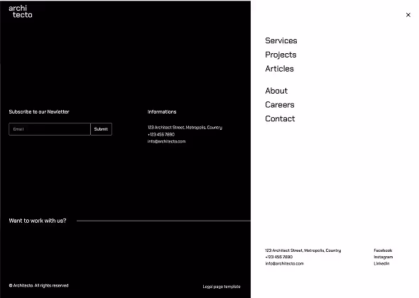
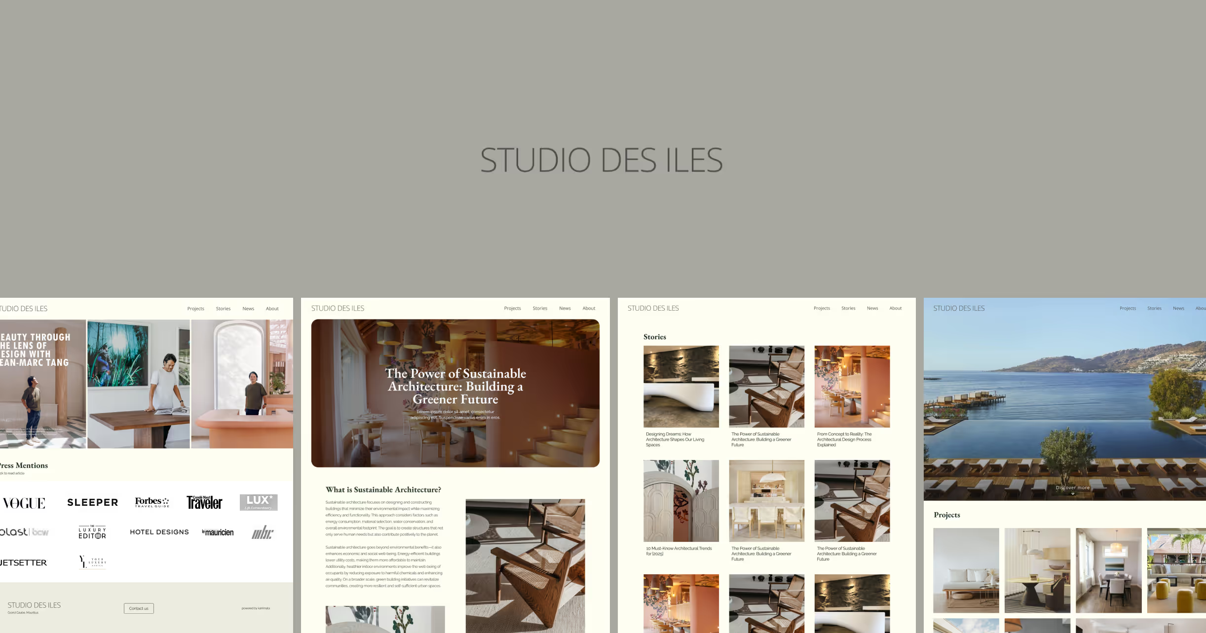
Home page
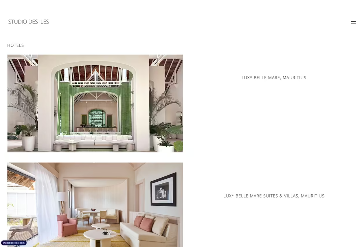
List of projects
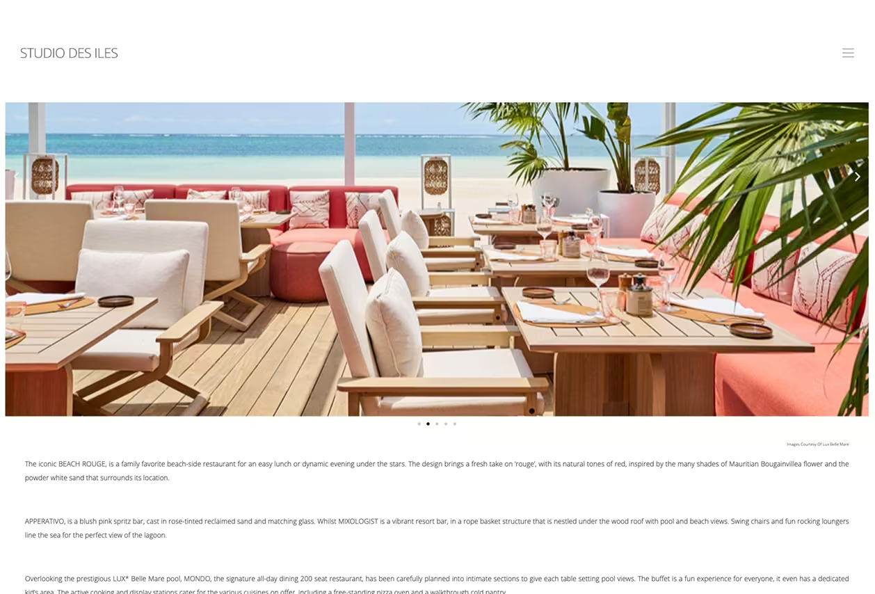
Project page
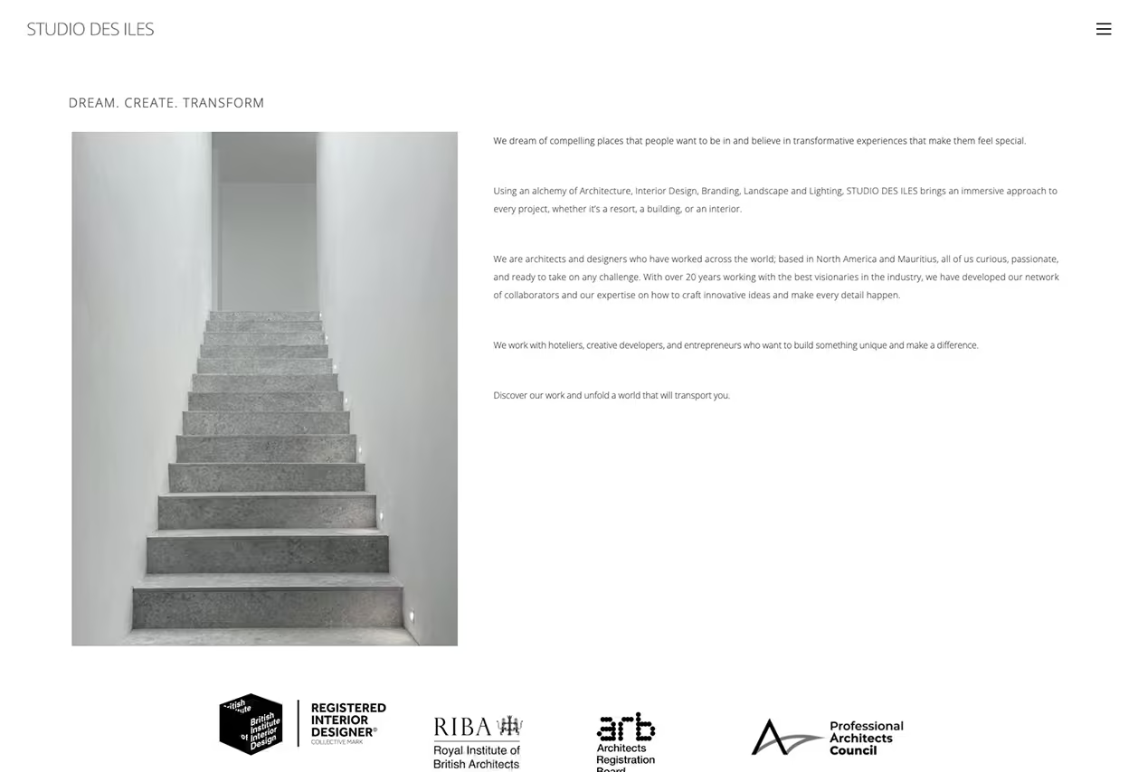
About
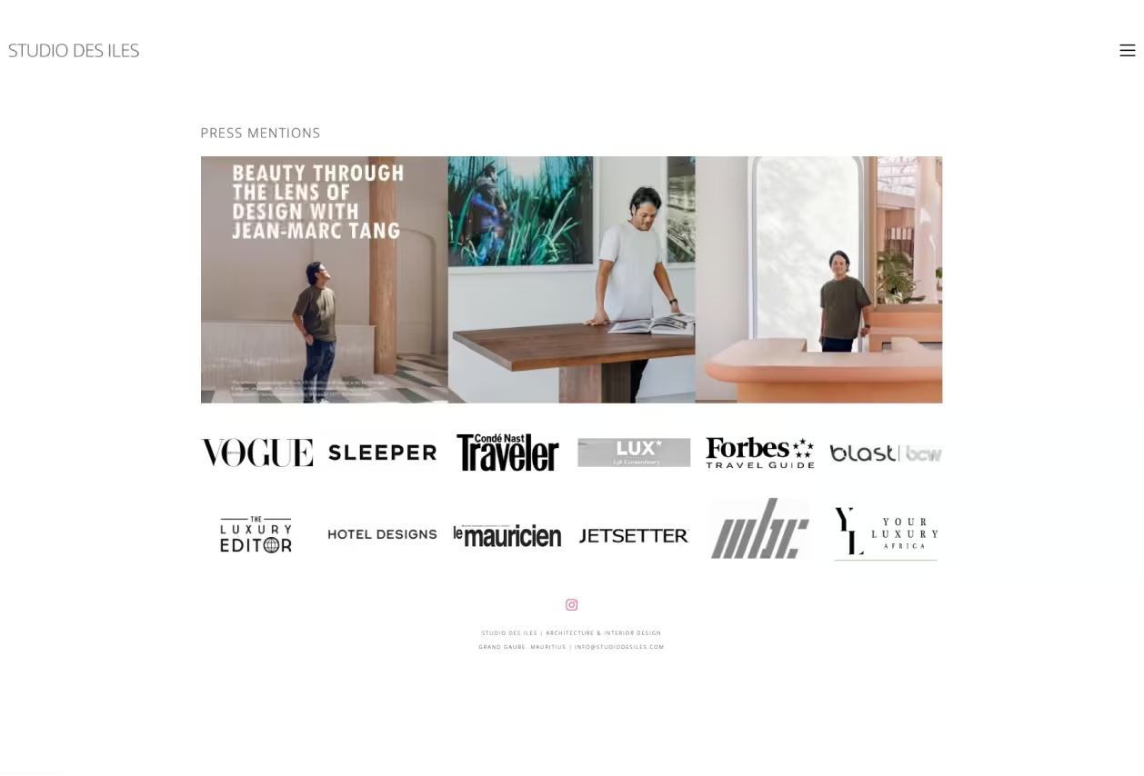
Press
UX Challenge and Solution
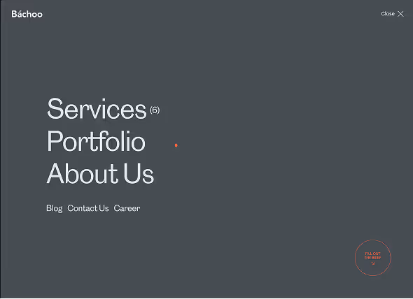
During our UX audit, we discovered the existing menu was difficult to use. Users struggled to find the pages they were looking for. Hover effects added unnecessary complexity, and the animations were distracting.
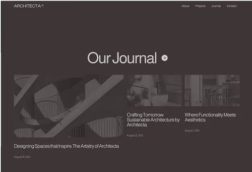
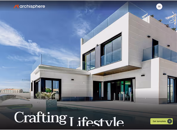
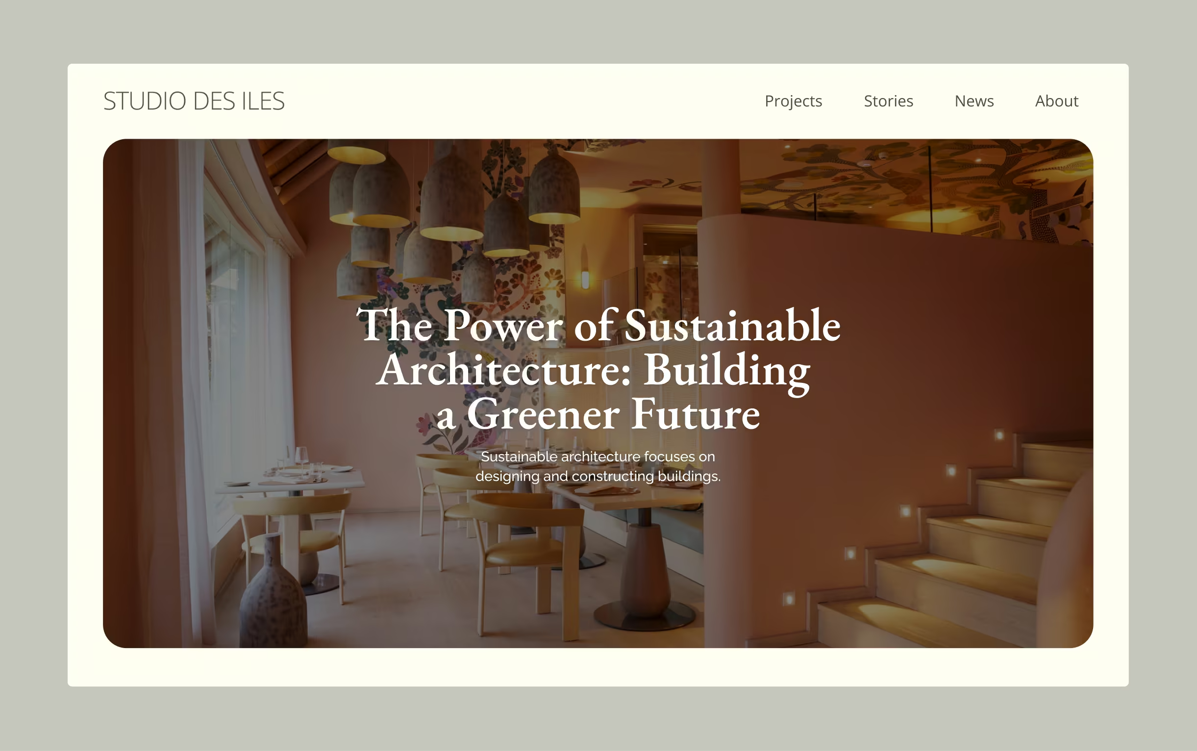
We simplified the navigation with a clean and easy-to-use menu. Users can now click the burger menu, choose “Projects,” and explore the work easily. The client also wanted an editorial layout with big, immersive images — so we made sure to bring that idea to life in the final design.
Mood Board Style
Designing an architecture-focused website means pushing creative boundaries. To kick off the UI phase, we first created a mood board to understand the design direction the client had in mind.
This helped us better understand his creative style and how he communicates through design. It gave us a solid starting point to begin the visual work.
About Us section

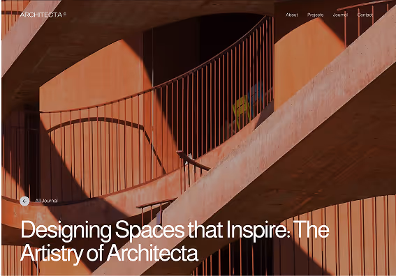
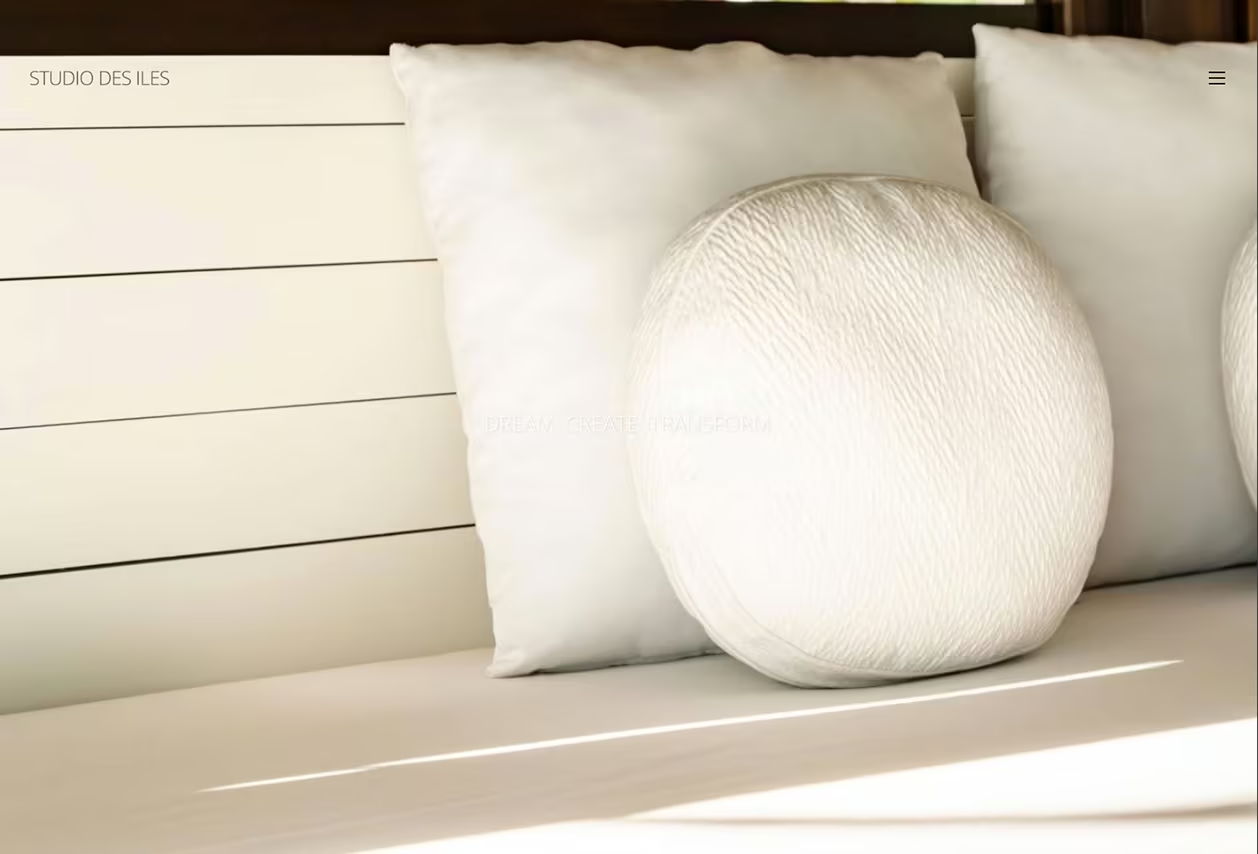
Hero Home page
Menu section
Key Requirements
The most important part of the website for the client was the project showcase. We needed to build a unique and engaging experience. After testing several approaches, one stood out: horizontal scrolling.
Since websites usually scroll vertically, switching to horizontal gave us a fresh way to display large, immersive images alongside the project stories. It felt more like browsing a design magazine — which matched the editorial look the client was aiming for.
Process
We used Figma for all design tasks and FigJam or Miro for brainstorming and collaboration. Weekly meetings helped align on progress, challenges, and ideas.
Communication with the client was smooth and clear. Every idea was considered, and all feedback was carefully reviewed. This helped us deliver a well-thought-out final product with no overlooked details.
UX Challenge
The client was inspired by printed media like magazines and booklets. This led us to explore a horizontal scroll layout, which fit that visual storytelling style perfectly.
We created a master page template with standard image and text styles, making it easy for the client to add new projects later without breaking the design consistency.
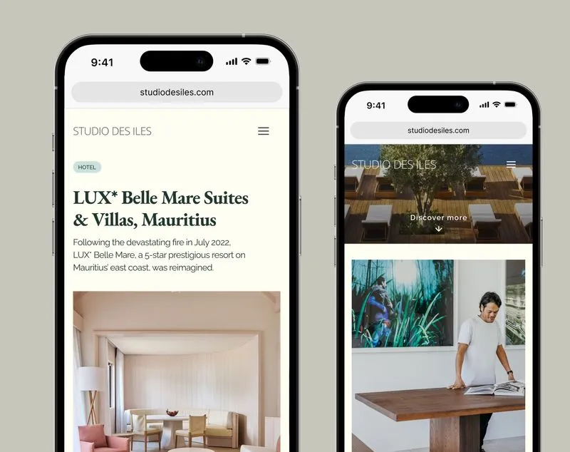
Mobile Design
We kept the mobile experience as close as possible to the original desktop version. Horizontal scrolling needed some careful thought, but for usability, we chose to keep most pages scrolling vertically.
Vertical scrolling felt more natural for smartphones, and it helped users view content more comfortably. We also preserved the immersive, image-heavy layout to maintain design consistency across all devices.
Results
Vertex Experience was hired to redesign the UX of the old website and create a more meaningful experience. According to the client, they were very happy with the result.Using Figma prototypes, they were able to test and share the site easily with stakeholders and collect feedback.
The final design is now being developed by a third-party agency using WordPress.
From our side, we’re proud of the result and really enjoyed the collaboration with the client.
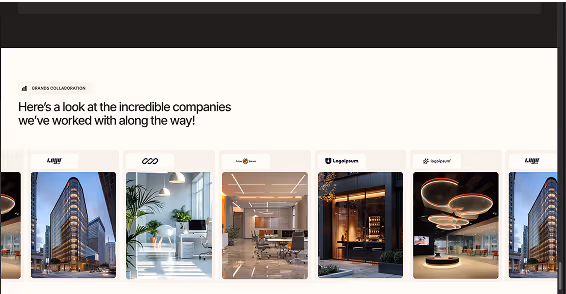
Featured work
Some projects cannot be showcased due to agreement so if you want to see more, please get in touch with the team.
Click Here